GPIO Control
The GPIO Control mode provides an interactive interface for toggling output pins directly from the display. Navigate through configured pins using button or joystick input, and press the primary button to flip output levels between high and low — all without leaving the panel.
Quick Start
How It Works
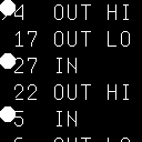
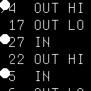
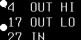
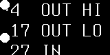
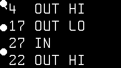
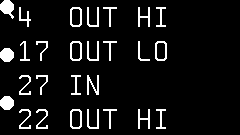
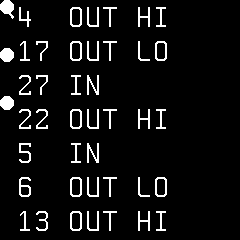
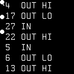
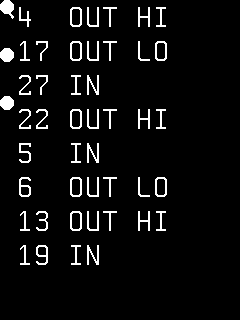
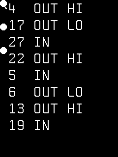
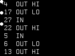
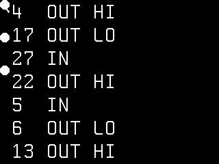
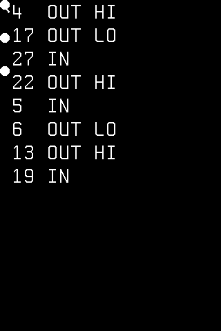
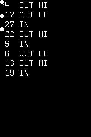
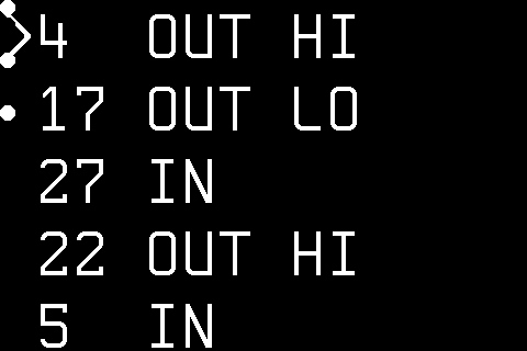
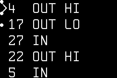
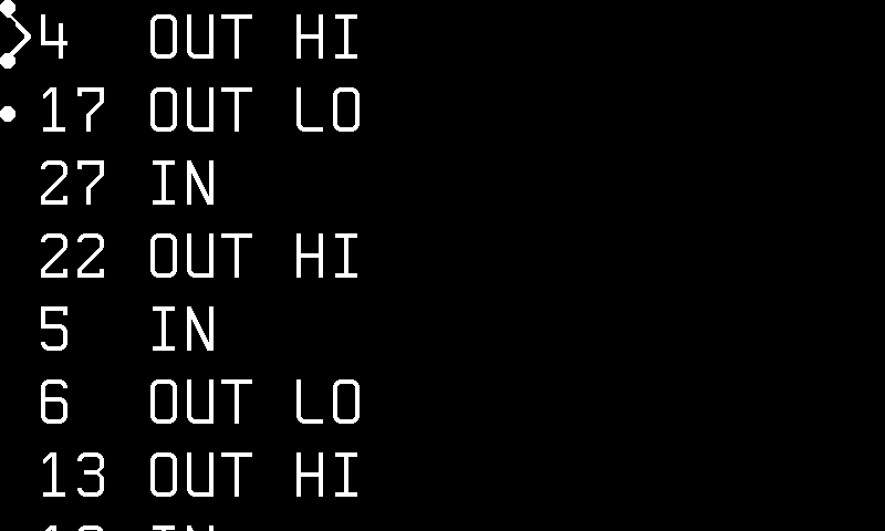
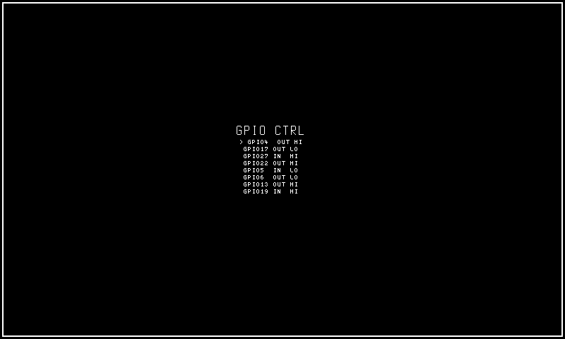
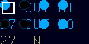
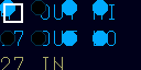
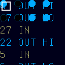
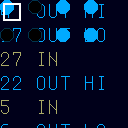
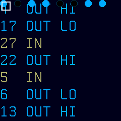
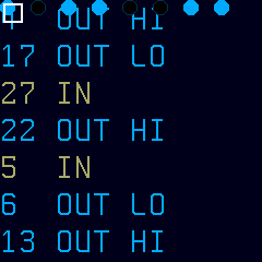
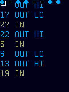
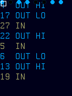
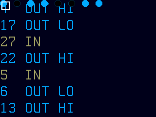
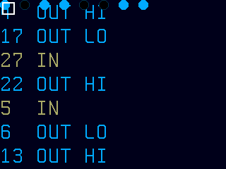
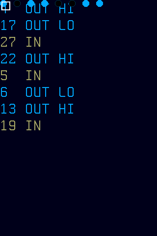
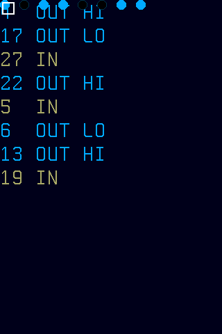
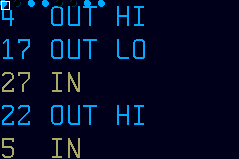
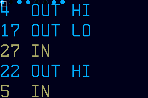
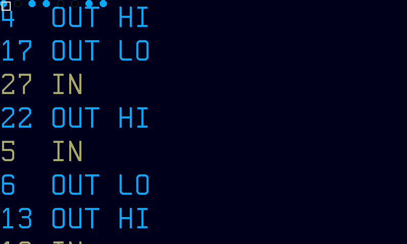
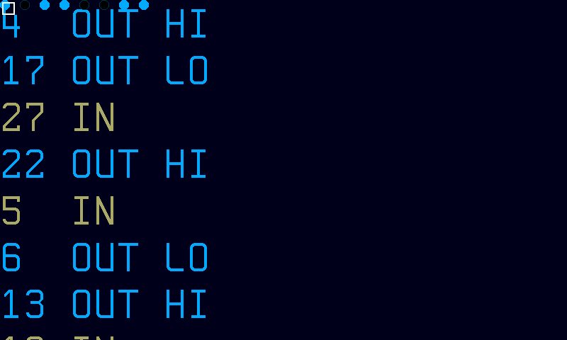
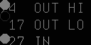
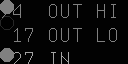
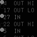
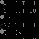
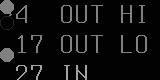
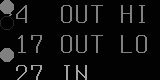
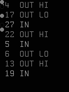
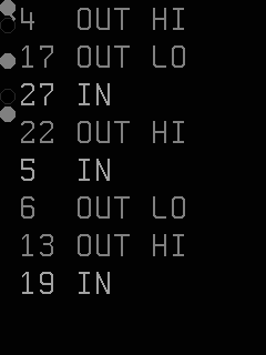
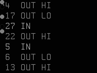
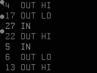
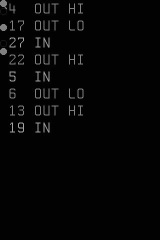
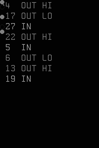
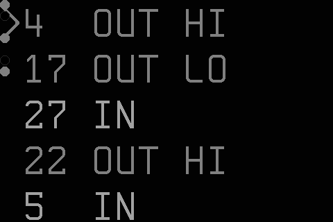
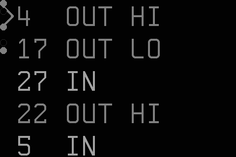
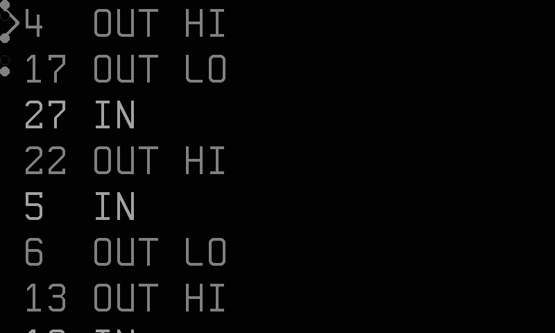
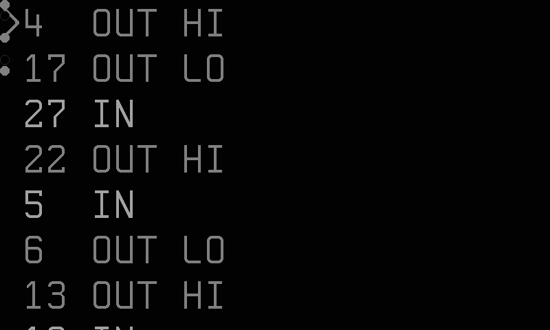
The GPIO Control mode presents a navigable list of all configured GPIO pins as text rows (or LED grid cells), with a visible cursor highlighting the currently selected pin. The display updates on the standard 1-second render-loop tick, reflecting any external pin-state changes, and redraws immediately when the user moves the cursor or toggles a pin.
Data is sourced from the same hardware GPIO manager as the read-only GPIO mode — only pins declared in your configuration file appear. When no GPIO pins are configured or the GPIO subsystem is unavailable, the mode shows an empty view. The mode requires physical input controls (buttons or joystick) for navigation and toggling; panels without input hardware can display the pin list but cannot interact with it.
Navigation uses up/down directional input to move the cursor through the pin list; pressing the primary button flips the selected output pin's logic level (high → low or low → high). Input pins appear in the view for monitoring purposes but are not actionable — toggling them has no effect. When the pin count exceeds the visible area the view scrolls automatically to keep the cursor within the viewport.
Note
Only output pins can be toggled. Input pins appear in the view for monitoring purposes but the primary button action is ignored for them.
Styles
The style option controls the visual layout and navigation model:
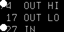
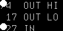
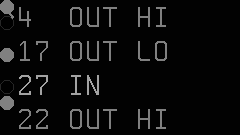
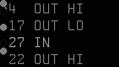
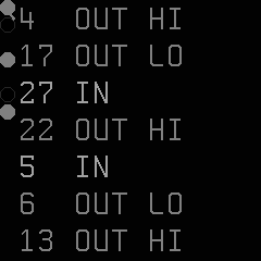
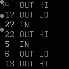
- list (default) — a scrollable text list showing each pin with its number, mode, level, and an LED state indicator for output pins. The cursor highlights the selected pin. Supports adaptive font selection and TextLabel rendering.
- compact — a condensed text list fitting more pins on screen by using shorter labels. Same navigation and toggle behavior as list style.
- grid — a visual LED grid where each pin is shown as a circle indicator arranged in a row-major grid. The cursor-selected pin is highlighted with a decorative border frame. Navigation moves the cursor by ±1 position through the linear grid. Best for smaller displays with many pins, giving a denser visual than the text-based styles.
When the pin count exceeds the visible area (in any style), the view scrolls to keep the cursor-selected pin within the visible region.
Options
| Key | Type | Description | Default | Allowed Values |
|---|---|---|---|---|
| style | string | Visual layout for the control interface | list | list, compact, grid |
| font | string | Font selection for text rendering | auto | auto, or any registered font ID (e.g., ascii-4x6, ascii-5x7) |
Configure options via the CLI:
CLI Examples
Set the display style to list:
Switch to compact layout:
Switch to the LED grid view:
Set a specific font:
Combine options:
Query all current settings:
This returns all key=value pairs reflecting the active configuration.
Font Selection
The font option controls which bitmap font is used for text rendering:
- auto (default) — the mode picks the largest font that fits the panel height while maintaining at least 4 visible rows. This adapts automatically to different panel resolutions.
- Specific font ID — any registered font identifier (e.g.,
ascii-4x6,ascii-5x7). If the ID isn't recognized, the mode silently falls back to automatic selection.
Font selection affects the list and compact styles. The grid style uses LED indicators exclusively and is not affected by font choice.
Grid Style Details
The grid style arranges pins as LED indicators in a row-major grid with double-spaced cells (each cell is twice the LED diameter in both width and height) for visual clarity. The cell grid dimensions are computed from the panel size:
- Diameter — determined by the panel's glyph height.
- Columns — how many cells fit horizontally:
floor(pixelWidth / (2 × diameter)). - Cursor highlight — the selected cell gets a decorative border frame overlay. If the panel's cell size is smaller than 16×16 pixels, the border is omitted but navigation still works.
- Scrolling — when pins exceed the visible grid, the view scrolls to keep the cursor in view.
Input Actions
| Input | Action |
|---|---|
| Up / K2 | Move selection up (previous item or grid cell) |
| Down / K3 | Move selection down (next item or grid cell) |
| Primary / K1 | Toggle selected output pin |
Navigation is linear (±1) in all styles — including the grid, where up/down moves through the row-major sequence.
Panel Compatibility
GPIO Control requires input controls (buttons or joystick) for pin selection and toggling. Panels without input support cannot use this mode — use the read-only GPIO mode instead. On monochrome panels, the selection cursor and pin states are rendered using inverse video or underline rather than color highlights.
| Capability | Description | Behavior |
|---|---|---|
| MonoFast | Fast-refresh monochrome OLED (128×32, 128×64, 128×128) | Supported — requires input controls. Pin list with inverse-video cursor selection |
| MonoSlow | Slow-refresh monochrome e-ink (122×250, 176×264, 200×200, 296×128, 400×300, 480×800, 800×480) | Supported — requires input controls. Static pin list, refreshes on navigation or toggle |
| GrayscaleFast | Fast-refresh grayscale (160×80, 240×135, 240×240, 320×240, 480×320, 800×480) | Supported — requires input controls. Grayscale cursor highlight with smooth navigation |
| GrayscaleSlow | Slow-refresh grayscale e-ink (122×250, 176×264, 200×200, 400×300, 800×480) | Supported — requires input controls. Static pin list, refreshes on navigation or toggle |
| ColorFast | Fast-refresh color TFT (128×128, 160×80, 240×135, 240×240, 320×240, 480×320, 800×480) | Supported — requires input controls. Color-coded pin states with highlighted cursor |
| ColorSlow | Slow-refresh color e-ink (122×250, 176×264, 200×200, 400×300, 800×480) | Supported — requires input controls. Static color pin list, refreshes on interaction |
For a read-only view that works on all panels, see GPIO.
Tip
Use style=grid on small panels with many pins for maximum density, or style=list when you need full text labels and state descriptions.
Related Pages
- Display Modes — overview of all available modes
- Getting Started: CLI Usage — introduction to
cyberhudctlcommands - Configuration — persistent configuration options
- GPIO — read-only pin state monitoring
- Pin Assignments — configure which pins appear in this view
Snapshots
Color
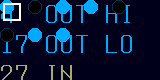
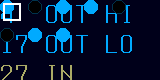
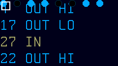
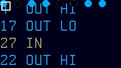
Grayscale
Mono