Test Widgets
Cycles through all registered UI widget types showing a demo preview of each. Use this mode to verify that widget rendering is correct on your panel and to preview the visual style of each widget component available in CyberHUD.
Quick Start
How It Works
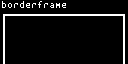
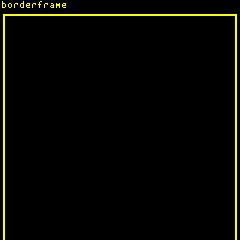
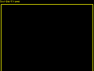
The test widgets mode showcases every registered widget type one at a time, cycling through them on a fixed 8-second interval. Each widget is rendered with sample data so you can see its visual appearance and verify correct rendering on your panel.
The following widget types are demonstrated in sequence:
- borderframe — decorative border container
- gradient — color/shade gradient fill
- LED — simulated LED indicator
- progressbar — horizontal progress indicator
- scaledtextbox — auto-scaling text container
- scrollbar — vertical scroll position indicator
- sparkline — miniature line chart
- textbox — standard text container
- textlabel — single-line text label
After displaying the last widget, the cycle restarts from the beginning.
Options
This mode has no configurable options.
Panel Compatibility
Test widgets is non-interactive and ignores all input actions. Works on all panels. Useful for verifying widget rendering across different display resolutions and color modes.
Related Pages
- Display Modes — overview of all available modes
- Test Pattern — fixed diagnostic pattern for validating screen configuration
Snapshots
Color
Mono